Multiscale Graph Correlation (MGC)#
Mit scipy.stats.multiscale_graphcorr können wir auf hochdimensionalen und nichtlinearen Daten auf Unabhängigkeit testen. Bevor wir beginnen, importieren wir einige nützliche Pakete
>>> import numpy as np
>>> import matplotlib.pyplot as plt; plt.style.use('classic')
>>> from scipy.stats import multiscale_graphcorr
Verwenden wir eine benutzerdefinierte Plot-Funktion, um die Datenbeziehung zu plotten
>>> def mgc_plot(x, y, sim_name, mgc_dict=None, only_viz=False,
...              only_mgc=False):
...     """Plot sim and MGC-plot"""
...     if not only_mgc:
...         # simulation
...         plt.figure(figsize=(8, 8))
...         ax = plt.gca()
...         ax.set_title(sim_name + " Simulation", fontsize=20)
...         ax.scatter(x, y)
...         ax.set_xlabel('X', fontsize=15)
...         ax.set_ylabel('Y', fontsize=15)
...         ax.axis('equal')
...         ax.tick_params(axis="x", labelsize=15)
...         ax.tick_params(axis="y", labelsize=15)
...         plt.show()
...     if not only_viz:
...         # local correlation map
...         plt.figure(figsize=(8,8))
...         ax = plt.gca()
...         mgc_map = mgc_dict["mgc_map"]
...         # draw heatmap
...         ax.set_title("Local Correlation Map", fontsize=20)
...         im = ax.imshow(mgc_map, cmap='YlGnBu')
...         # colorbar
...         cbar = ax.figure.colorbar(im, ax=ax)
...         cbar.ax.set_ylabel("", rotation=-90, va="bottom")
...         ax.invert_yaxis()
...         # Turn spines off and create white grid.
...         for edge, spine in ax.spines.items():
...             spine.set_visible(False)
...         # optimal scale
...         opt_scale = mgc_dict["opt_scale"]
...         ax.scatter(opt_scale[0], opt_scale[1],
...                    marker='X', s=200, color='red')
...         # other formatting
...         ax.tick_params(bottom="off", left="off")
...         ax.set_xlabel('#Neighbors for X', fontsize=15)
...         ax.set_ylabel('#Neighbors for Y', fontsize=15)
...         ax.tick_params(axis="x", labelsize=15)
...         ax.tick_params(axis="y", labelsize=15)
...         ax.set_xlim(0, 100)
...         ax.set_ylim(0, 100)
...         plt.show()
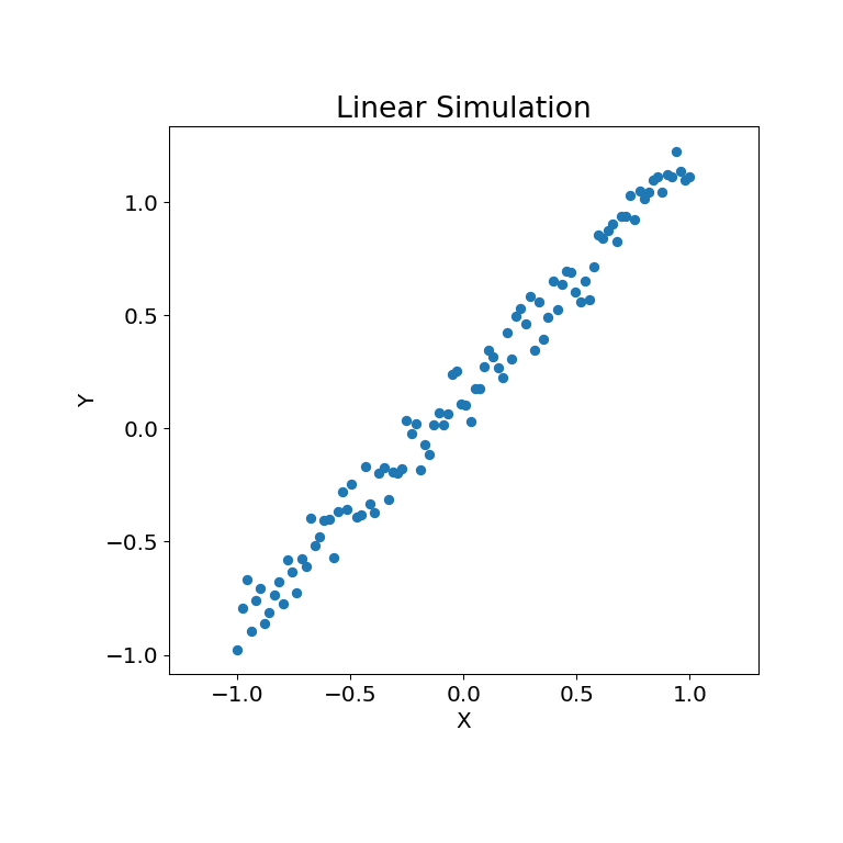
Betrachten wir zunächst einige lineare Daten
>>> rng = np.random.default_rng()
>>> x = np.linspace(-1, 1, num=100)
>>> y = x + 0.3 * rng.random(x.size)
Die Simulationsbeziehung kann unten dargestellt werden
>>> mgc_plot(x, y, "Linear", only_viz=True)
Nun können wir die Teststatistik, den p-Wert und die MGC-Karte visualisiert unten sehen. Die optimale Skala ist auf der Karte als rotes „x“ gekennzeichnet
>>> stat, pvalue, mgc_dict = multiscale_graphcorr(x, y)
>>> print("MGC test statistic: ", round(stat, 1))
MGC test statistic:  1.0
>>> print("P-value: ", round(pvalue, 1))
P-value:  0.0
>>> mgc_plot(x, y, "Linear", mgc_dict, only_mgc=True)
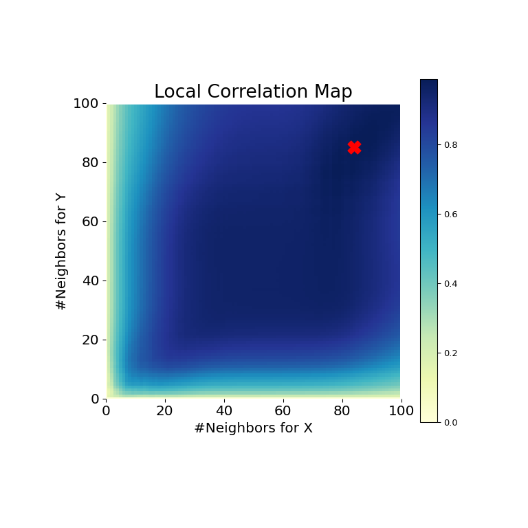
Es ist hier offensichtlich, dass MGC in der Lage ist, eine Beziehung zwischen den Eingabedatenmatrizen zu ermitteln, da der p-Wert sehr niedrig und die MGC-Teststatistik relativ hoch ist. Die MGC-Karte deutet auf eine stark lineare Beziehung hin. Intuitiv liegt dies daran, dass mehr Nachbarn bei der Identifizierung einer linearen Beziehung zwischen \(x\) und \(y\) helfen. Die optimale Skala ist in diesem Fall äquivalent zur globalen Skala, markiert durch einen roten Punkt auf der Karte.
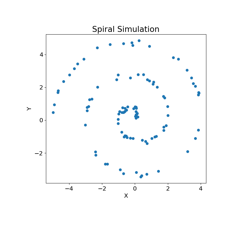
Dasselbe kann für nichtlineare Datensätze getan werden. Die folgenden Arrays \(x\) und \(y\) stammen aus einer nichtlinearen Simulation
>>> unif = np.array(rng.uniform(0, 5, size=100))
>>> x = unif * np.cos(np.pi * unif)
>>> y = unif * np.sin(np.pi * unif) + 0.4 * rng.random(x.size)
Die Simulationsbeziehung kann unten dargestellt werden
>>> mgc_plot(x, y, "Spiral", only_viz=True)
Nun können wir die Teststatistik, den p-Wert und die MGC-Karte visualisiert unten sehen. Die optimale Skala ist auf der Karte als rotes „x“ gekennzeichnet
>>> stat, pvalue, mgc_dict = multiscale_graphcorr(x, y)
>>> print("MGC test statistic: ", round(stat, 1))
MGC test statistic:  0.2  # random
>>> print("P-value: ", round(pvalue, 1))
P-value:  0.0
>>> mgc_plot(x, y, "Spiral", mgc_dict, only_mgc=True)
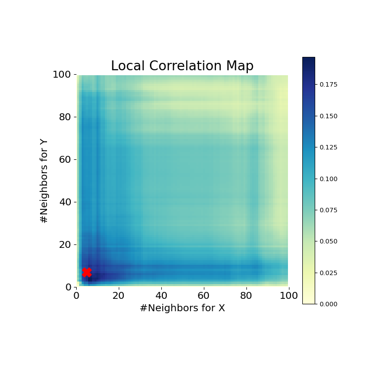
Es ist hier offensichtlich, dass MGC erneut eine Beziehung ermitteln kann, da der p-Wert sehr niedrig und die MGC-Teststatistik relativ hoch ist. Die MGC-Karte deutet auf eine stark nichtlineare Beziehung hin. Die optimale Skala ist in diesem Fall äquivalent zur lokalen Skala, markiert durch einen roten Punkt auf der Karte.